
I am currently not available but feel free to get in touch ! contact me
mēkā, creative chatbot
Client
mekacreative.io
Year
2018/2019
Case
Artifical intelligence for creative profiles sourcing and recruiting
Scope
MVP, development process, from discovery through to delivery, Front-end Dev
Overview
Skills I grew in this project
- Research
- Synthesis and ideation
- Prototyping & design
- Storytelling
- Product roadmap strategy
- Retention/engagement metrics
- AI / ML
- Emotional intelligence
- Service design
- Psychology / behavior design
- Empathy for end-user
"I want to assess and improve individual creativity"
Meka is a conversational bot oriented to creativity. It has been designed to identify and train creative profiles. I took part as a founder and UX Designer in this project alongside with one serial entrepreneur and researcher in creativity and one full-stack developper.
Creative industries face an information gap on skills : there is little evidence on the skills required by creative talent. Based on our knowledge and the creative profiles I prepared for various domains, I aim to help companies in hiring creative profiles.
Creativity is about connecting dots. When designing meka we decided to connect psychology, machine learning and conversational ui dots. This project is still on going and first BETA version is to be released in 2021.
Creativity is about connecting dots. mēkā connects psychology, machine learning and conversational ui
Framing / product validation
Framing the project with a couple of short sentences help to drive upcoming researches toward the correct direction.
Our product is:
- For individuals and companies,
- Who want to assess and train creativity,
- The process is run by a AI driven chat bot,
- That makes assessment faster and more accurate,
- Unlike most of the generic form products.
Users and market research
I then have been collecting information from similar products : scope, strategy, UX... I quickly realized that most of the products were just online forms or HR software oriented to talent management with no real in-depth creativity features. On top of that, all of them offer a generic approach to creativity and I were not able to find any domain-specific assessment. Our assumption is creativity must be assessed within a specific domain for the output to be valuable. Two types of users will be using mēkā : people wanting to assess their creativity in specific domains with the free version and hiring managers using mēkā pro in order to take the best decision. Based on this, I created two types of persona.

Persona
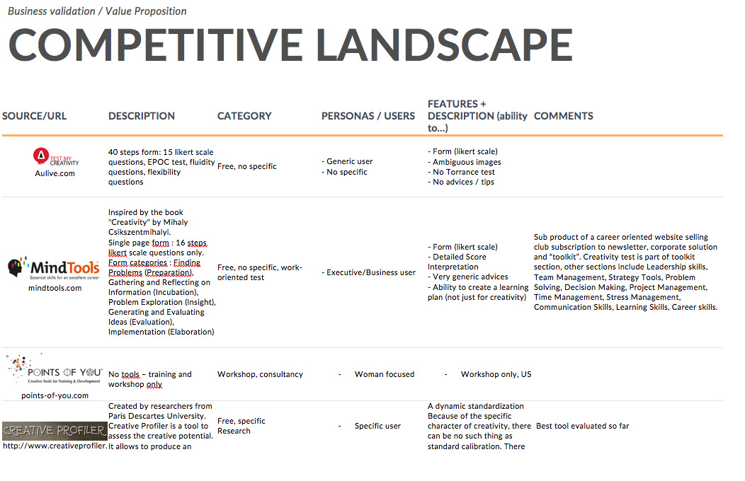
Competitive landscape (excerpt)
Deliverables / Methods
Proto-persona, Competitive landscape, Business canvasHigh level user journey
I defined and documented what would be the typical user journey for an applicant and a HR manager. User journey is a game mechanic which aims at making the process of interaction with a product easier and more understandable. A user feels as a real player starting the personal journey of the product usage. Designers plan different stages which a player (user) will gradually go through. Let’s look at the common steps which a user journey includes.
Deliverables / Methods
User journey steps, wireframes.Features Matrix
As an output from the previous phases I created a matrix including the user journey and the identified features for MVP. This helped us to make a first assumption on what should be the key features and the feasibility of the project.
Deliverables / Methods
Identified product opportunities, Value Proposition, Description of the profitability model, metrics & growth perspectives (traffic), Benchmarking. Features Priorization (micro and macro). First technical effort estimation.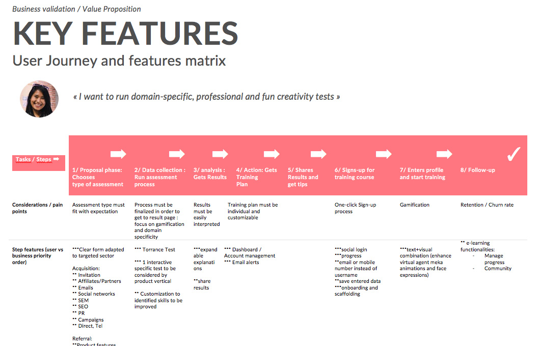
Micro feature priorization for MVP (user-focus). Alongside this document I also created a macro feature priorization for MVP (product vs competition)
Design process
Design process for application setup
For the design of the dashboard I first run a couple of meetings in order to collect the goals, user needs, constraints of the previously identified features. I then designed a couple of tasks flows. Designing flows helps everybody understand the processes and refine them if necessary without losing time with design. Once validated I kicked off the design process as described below :

This is the process I am following in most of my projects. I like to get to code early as it facilitates prototyping and hand-off to developers.
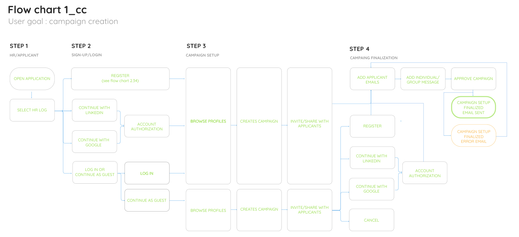
Task flows are the starting point of my design process. I validate them with business and start mocking up on this basis.
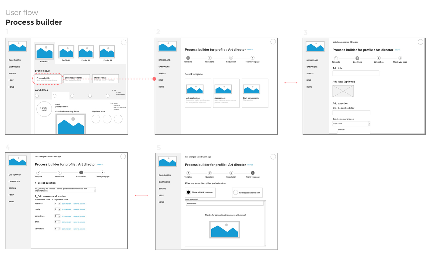
Once I finalize low-fi wireframes I merge them into the user flow and run another round of feedback. I usually use axure for the wireframes, then use them for user flows design in Overflow or Sketch.

Invision prototype I share for feedback includes elements of what will be the final visual design.
Design process for conversational UI
Triggers for users
At this point that I had a clear vision of what the approach to the product should be. I therefore started to identify what kind of triggers would make the users willing to use meka : cool UI (likebility), powerful AI (authority) and gamification for applicants (engagement). Doing this in the early steps of the project will help to align the features to be developed with the product long-term view. It turned out that a conversational interface would be the best option for this product. I try not to think too much about any technical constraint at that point but still involve devs in my meeting.
UI Research : the benefits of conversational interface
Most of the assessment test online are very looonnnng endless forms. In our case I needed at least 50 inputs in order to assess a profile. This would have meant that many users would have quickly drop the process...
I needed to capture the information in a more engaging way.
I therefore decided to go for the conversational approach. I first considered using a natural language chat approach, using and processing the text the user provides. It was not the right approach for two reasons : this is still a painful process for the user and the development cost for treating and process open inputs was too high. It was also error prone.
Our hybrid approach : capturing relevant information in a playful way
prototype
I decided to implement an hybrid approach allowing us to capture information by following a conversational path already defined combining chat, voice with UI elements. There are many benefits to this approach : information is provided progressively under user´s command, the process can be stopped and saved at any time. It also provides one clear call to action for each test provided by the system.
Getting better user engagement : mēkā, the face of a product
This hybrid conversation interface approach allowed us to be more creative for a better man-machine interactions. I created our friendly character, mēkā. mēkā will be the face of our product. I wanted it to be playful, funny and easy going in order to immediately grab users' attention and become memorable to them. To do so I looked for inspiration and wanted to create a Kawaii face style to connect with the user. I only took the charming and childlike parts from Kawaii as we also needed to provide authority to the character. On the technical side, we needed a character light and easy to animate so we used SVG. For the BETA version I kept the interaction pretty simples but I am working on more complex interactions as I am convinced that quality interactions with mēkā will lead to quality engagement with our applicants.

mēkā, the mascot I designed for UI interactions and increase user engagement (did you notice the Bowie touch? ;-) Made in SVG vectors for better quality, performance and animations
Increasing engagement with social cues
With mēkā we are covering a wide range of social cues, helping our users to conect with the product : physical (eyes, face, movement), psychologocial (humor, personality, empathy...), social dynamics (cooperation, reciprocity) and social role (principle of authority by assuming the roles of teacher and guide in the process by reporting measurements and providing analysis). Social cues are suitable are appropriate and highly recommended for educational products. Creating mēkā helped us in our gamification strategy.
Gamification
Gamification is another trigger I wanted to use for mēkā. Our product is also an educational product, I aim to help people embracing the creative mindset. Turning learning into a fun game improves engagement and retention.
Completion
The user is guided through completing their assessment in the most efficient way possible and progression is shown by the percent of test completeness. For the future realeases I plan to introduce a slight "challenge" approach in order to keep users motivated.
The right quantity of friction
I know that people learn much more from failure than from success. A balanced level of friction is inherent to educational product and can also lead to more engagement if related to a test and not the overall product !
Customization
Users expect individuality. I also decided to allocate development time for customization of their profiles and their own man-machine interaction. This will help our users to engage more with mēkā.
Implementation costs
Conversational Interface was also the cheapest option with regards of the team skillset. The front-end of the app is essentially designed in SVG. SVG is light and powerfull. I can therefore directly implement or test new ideas with less front-back interactions... Saving time and money with the app development allows us to invest more in AI training. I decided to follow the conversational interface option and started to work on the wireframes taking into account all the inputs provided in research phases (priorized features, art direction, triggers)
Deliverables / Methods
Low/hi-fi wireframes, PrototypeProduct strategy
Once we were confident about the information we collected on users, the market and the product it was time to discuss and plan what would be our strategy. Based on the inputs from the wireframes and drafts I created of the product I coded a prototype including what I identified as core features. I like to use code when deciding what will be the key features for a product. Seeing things in context is key. After a couple of iteration sessions with all the team I all meet in order to gather insights about the product goals. It helps prioritize features and define our key performance indicators (KPIs). KPIs help inform design decisions along the way and measure results of the UX efforts.
Deliverables / Methods
Overall product strategy including long-term goals and KPI, Product roadmap including development effortCurrent status
We are currently working on the development of the product. I decided to use the prototype I designed in the landing page and track every single interaction. meka will be domain specific (art/design, business, coding, music and ... yes, cooking!). I will be using a common template for all combined with one specific test for each domain. The development of the specific test for each domain is resource consuming so I decided to check which domain most users wanted to train.
Launch
Hopefully somewhere in 2021! Please visit uxpages.com and spread the word!
skills I grew in this project
- research
- synthesis and ideation
- prototyping & design
- storytelling
- product roadmap strategy
- retention/engagement metrics
- AI / ML
- emotional intelligence
- service design
- psychology / behavior design
- empathy for end-user
tools I am using in this project
- Axure
- Sketch / Illustrator
- Invision
- Visual Studio Code
- Git
- HTML/CSS Javascript
- React (design integration)
- User brain (testing)
Since you are here
My goal is to help you create great and profitable products.
If you drop me a line about your work and the challenges you face I will reply with some suggestions (I always do).
You can also directly schedule a call.
Thank you for your interest.
I work from the Canary Islands. GMT Time zone UTC +0, London time.