I am currently not available but feel free to get in touch ! contact me
Client
binter.com
Year
2023
Case
Unique source of trust for multiplatform delivery. Bridging the gap in between designers and developers
Scope
Design Operations, Design System, Figma, Design Tokens, Style Dictionary, Storybook, UI/UX design, Front-end Dev
Overview
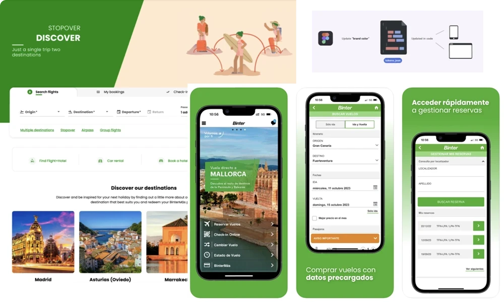
I had the opportunity to collaborate with an airline on a comprehensive redesign of their flight booking platforms, covering their website, iOS app, and Android app. This case study details how we leveraged a design system in Figma, exported design tokens with Design Tokens plugins to Style Dictionary, and used Storybook for component validation. The React components were developed and distributed via npm packages to ensure a scalable and consistent user experience across all platforms. Stakeholder feedback and iterative design refinements played a crucial role throughout the process.
Achievements
Figma as a unique source of trust for multiplatform delivery.
Led 1 designer, 1 researcher and provided guidance to dev team
Design-to-dev workflow improvement negotiation with dev team
Conversion Rate Optimization
UX methodology and deliverables
Design Operations
UX Design
1. Building the Design System in Figma
We began by designing a centralized design system in Figma that would serve as the single source of truth for all UI components, typography, colors, and layout guidelines. This design system was structured to support the unique needs of the airline’s web and mobile platforms, allowing for reusable components that could easily be adapted across different devices. UI Components: Key elements like buttons, form fields, modals, and navigation bars were created in Figma with responsive variants to ensure consistency across devices. Design Tokens: Color palettes, typography styles, spacing units, and other design tokens were established in Figma to maintain coherence across platforms and speed up the handoff to developers.
2. Exporting Design Tokens from Figma
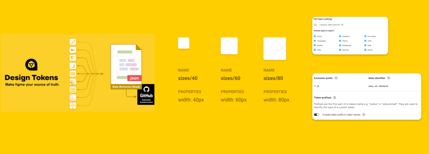
One of the most crucial aspects of ensuring consistency across platforms is the effective use of design tokens. Design tokens act as the common language between designers and developers, enabling both teams to work together seamlessly when it comes to core design values such as colors, fonts, and spacing. They play a key role in streamlining UI design, making it easier to maintain and scale systems.
What Are Design Tokens?
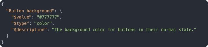
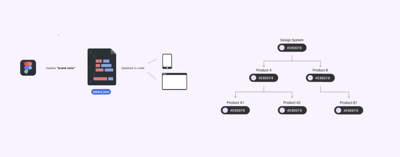
Design tokens are essentially a bridge between design and code. They store all the design decisions (like colors, typography, spacing, and more) in a format that can be easily interpreted by both designers and developers. Rather than manually adjusting design values across multiple components or platforms, tokens allow for central management of these values, ensuring that a change in one token (for example, a brand color) is automatically reflected across all products.
For example, in a typical system, if you wanted to update a color that is used in multiple places (like buttons, backgrounds, or text), you’d need to go into each instance of that color and manually update it. However, with design tokens, you simply update the token’s value, and the change propagates across all components referencing it. This drastically reduces the potential for inconsistencies and errors, making the design system both scalable and easier to maintain.
The Role of Design Tokens in Our Process
In this project, design tokens were integral to achieving consistency across the web, iOS, and Android platforms. After creating the design system in Figma, we used the Figma Tokens plugin to export the key design values (like color palettes, font styles, and spacing units) as JSON files. These design tokens were then processed using Style Dictionary, which allowed us to convert them into platform-specific code for web, iOS, and Android.
Unified Codebase: Design tokens unified the codebase by serving as a single source of truth for design decisions. These tokens could be referenced in the code for all platforms, ensuring that a change in one token would automatically update all related components.
Platform-Specific Adjustments: Once exported from Figma, Style Dictionary allowed us to tailor the tokens for different platforms. For instance, certain colors or spacings could be adjusted for mobile devices versus desktop web experiences, ensuring that each platform retained the same look and feel while optimizing for platform-specific behaviors.
Why Use Design Tokens?
By integrating design tokens into the development process, we achieved several key benefits:
Efficiency: Updating the UI across multiple platforms became much faster. Instead of manually updating values across different environments, a simple change to the design token would automatically be reflected everywhere the token was applied.
Consistency: Design tokens ensured that all components, regardless of platform, adhered to the same design principles. This minimized the risk of inconsistencies creeping in as the product scaled.
Error Reduction: With design tokens, developers didn’t have to manually input raw values for things like colors or fonts, which reduced the likelihood of mistakes. This also streamlined the coding process by allowing developers to focus more on functionality rather than design details.
Alias Framework: An important concept in design tokens is the use of aliases. Aliases allow for the same value (such as a color or spacing unit) to be applied to multiple components, but also make it easy to adjust these values for specific contexts. For example, if we needed to implement a dark mode version of the UI, we could adjust a single alias to reflect dark mode colors, and it would automatically update across all components that used that token.
How to Create Design Tokens?
Although there isn’t a universal standard for design tokens yet, frameworks and recommendations are being established. The W3C Design Token Community Group shared an initial naming framework in 2022, and Google’s Material Design 3 provides guidelines on how to use design tokens within its system.
To create a comprehensive set of design tokens, it’s important to:
Establish Clear Naming Conventions: Design tokens should follow clear and logical naming conventions to ensure easy understanding and application across teams. For example, you could have token categories like brand.primary.color or font.heading.size, making it clear what each token refers to and where it should be applied.
Apply to Multiple Layers: Tokens can be applied to various components or layers, and grouped by categories like brand, platform, or use case (e.g., dark mode vs. light mode). This ensures that the design system remains adaptable while retaining coherence.
Leverage Aliases for Flexibility: By using aliases, you can manage variations within your design system (such as different modes or themes) without duplicating tokens. This allows for quick adjustments when switching between different environments, such as transitioning from light mode to dark mode.
The Design Token Framework in Action
By adopting a design token framework, we ensured the efficient management of design assets across platforms. This was particularly useful when adapting designs for mobile and web platforms. For example, when implementing dark mode, we were able to update only the tokens related to colors and backgrounds, ensuring a smooth transition between themes without the need for extensive rework.
In essence, design tokens allowed us to:
3. Exporting Design Tokens with Style Dictionary
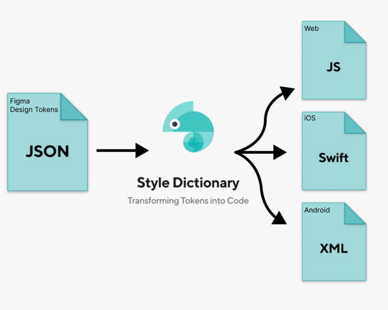
To translate the design system from Figma to development, we used plugins such as Figma Tokens to export design tokens. These tokens were then converted into platform-specific formats using Style Dictionary. Figma to Code: The Figma Tokens plugin allowed us to extract key design properties (colors, font sizes, spacings) directly from Figma and output them as JSON files, which were processed by Style Dictionary. Cross-Platform Support: Style Dictionary enabled the automatic generation of design tokens for multiple platforms (web, iOS, and Android), ensuring that the designs were implemented consistently across all environments.
4. Component Documentation and Validation with Storybook
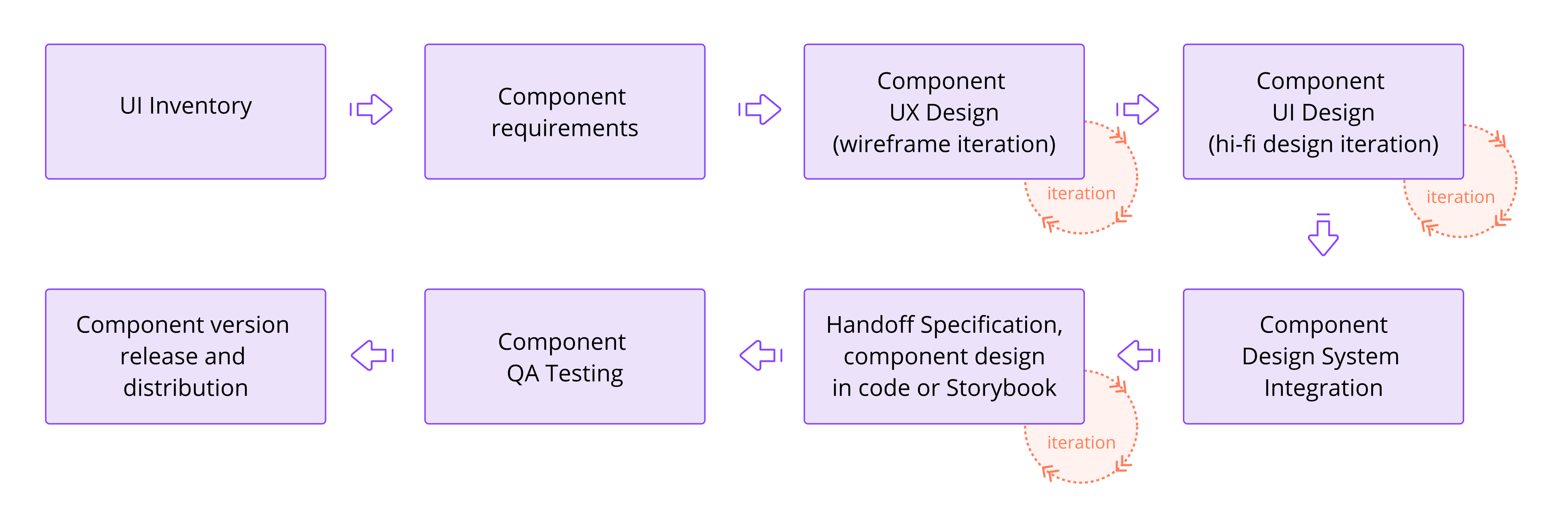
Once the design tokens were in place, we began the development of UI components in React. To maintain a smooth collaboration between designers and developers, we set up Storybook to document and showcase components in isolation. Storybook Integration: Each component (buttons, form elements, etc.) was developed and tested within Storybook, providing a visual representation of its different states (hover, active, disabled) and making it easier for stakeholders to review. Design Validation: Designers could visually compare the implemented components in Storybook against the original Figma designs, allowing for real-time feedback and adjustments to ensure fidelity.
5. Component Development in React and Distribution via npm
The next phase was to develop the components using React, ensuring that they were reusable and easily maintainable. Each component was designed to be modular and scalable across different platforms. Reusable React Components: We built each UI component (e.g., buttons, date pickers, modals) in React, with a focus on reusability across the web, iOS, and Android platforms. Platform-specific customizations were handled where needed (such as touch-specific interactions on mobile). npm Distribution: To streamline component updates and ensure consistency across platforms, the React components were bundled into npm packages and distributed internally. This allowed developers working on different parts of the project to easily pull in the latest versions of the components.
6. Iterative Feedback and Stakeholder Validation
Throughout the project, we held regular review sessions with stakeholders, including heads of design and technology, to validate progress and gather feedback. This iterative process ensured that the final design aligned with both business goals and user expectations. Continuous Feedback Loop: Storybook provided a platform for stakeholders to visualize components and their interactions, facilitating ongoing feedback. Design changes were easily incorporated, and any new requirements were integrated into the component library. Agile Iterations: We worked in an agile environment, making incremental improvements based on feedback, and rapidly iterating on designs and components. Each iteration included refinements to user flows, accessibility enhancements, and performance optimizations.
Outcome
By the end of the project, we had successfully delivered a cohesive, multi-platform flight booking experience that was consistent across web, iOS, and Android. The design system we established in Figma, combined with the development of React components and their distribution via npm, resulted in a scalable solution that allowed the airline to easily maintain and update their platforms.
- Consistency Across Platforms: The centralized design system ensured that all components looked and functioned consistently, regardless of the platform.
- Faster Iterations: By integrating tools like Figma Tokens, Style Dictionary, and Storybook, we drastically reduced the time required to go from design to development, allowing for faster iterations and a smoother workflow.
- Scalability: The use of npm for distributing React components allowed the airline to manage future updates efficiently, ensuring that all teams could access the latest versions of UI elements.
Since you are here
My goal is to help you create great and profitable products.
If you drop me a line about your work and the challenges you face I will reply with some suggestions (I always do).
You can also directly schedule a call.
Thank you for your interest.
I work from France and Spain. GMT Time zone UTC +0, London time.

